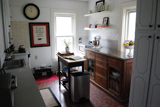
I couldn't be more thankful that our buffet from Randy fit in here. It provided necessary storage for us, and it warmed up the space and made me happy. We painted over the faux-stone looking wall paper with plain white because I didn't know how else to salvage this room.
Before -
See...I wasn't kidding about the blue, right?
Check out the faux-stone wallpaper, gray laminate wall, the light fixtures...ugh.
See that drop ceiling? and, can you see the laminate 'crown moulding'? Blek.
After -
Our Ikea Lack shelves that never sat flush against the wall....but, to their credit, they never dropped my cookbooks - PHEW!
Some vintage towels I found on eBay, hanging on a towel rack I made out of dowel rods and ribbon I had laying around...
I adore this poster that we had framed from the Keep Calm Gallery.


I love the eclectic touch you applied to your kitchen! I even love that you kept the cabinetry and incorporated the black outlines into your new look. The poster is the best and the clock above just sets the stage. Love the wood buffet blended in. Great room! I'm working on my remodel right now, so wish me luck!
ReplyDelete